
Getting Started
Analyse data with graph and pivot views
What this does
Turns a list of records into an answer. Most apps have a Reporting menu, and behind it the same two generic views: the graph for spotting trends, the pivot for breaking numbers apart.
Steps
You can find several reports under the Reporting menu of most apps that let you analyze and visualize the data of your records.
-
01
Open the report from the app's Reporting menu.
-
02
Filter first — a chart of the wrong records is worse than no chart. Set the period and any other conditions in the search bar.
-
03
Switch view with the buttons at the top right: the graph icon or the pivot icon.
-
04
Click Measures and choose what is being counted. Only numeric fields can be measured; Count counts records.
-
05
Add a Group By for the dimension you want to analyse — by month, by salesperson, by product category.
Selecting a view
Depending on the report, WindoorERP can display the data in various ways. Sometimes, a unique view fully tailored to the report is available, while several views are available for others. However, two generic views are dedicated to reporting: the graph and pivot views.
Graph view
The graph view is used to visualize your records' data, helping you identify patterns and trends. The view is often found under the Reporting menu of apps but can be found elsewhere. Click the graph view button located at the top right to access it.
Pivot view
The pivot view is used to aggregate your records' data and break it down for analysis. The view is often found under the Reporting menu of apps but can be found elsewhere. Click the pivot view button located at the top right to access it.
Choosing measures
After selecting a view, you should ensure only the relevant records are filtered. Next, you should choose what is measured. By default, a measure is always selected. If you wish to edit it, click Measures and choose one or, only for pivots, multiple measures.
Note
When you select a measure, WindoorERP aggregates the values recorded on that field for the filtered records. Only numerical fields (integer, decimal, monetary) can be measured. In addition, the Count option is used to count the total number of filtered records.
After choosing what you want to measure, you can define how the data should be grouped depending on the dimension you want to analyze. By default, the data is often grouped by Date > Month, which is used to analyze the evolution of a measure over the months.
Example
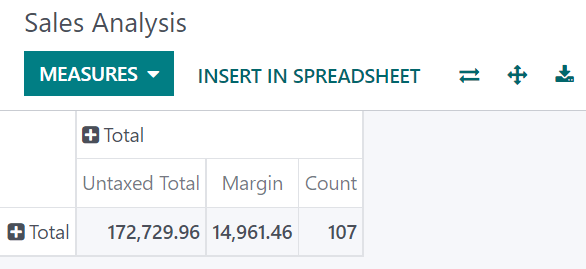
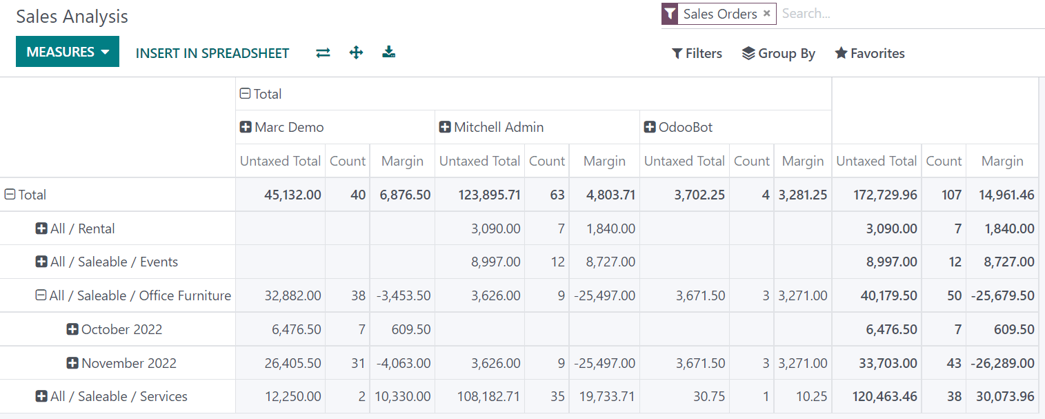
Among other measures, you could add the Margin and Count measures to the Sales Analysis report. By default, the Untaxed Amount measure is selected.
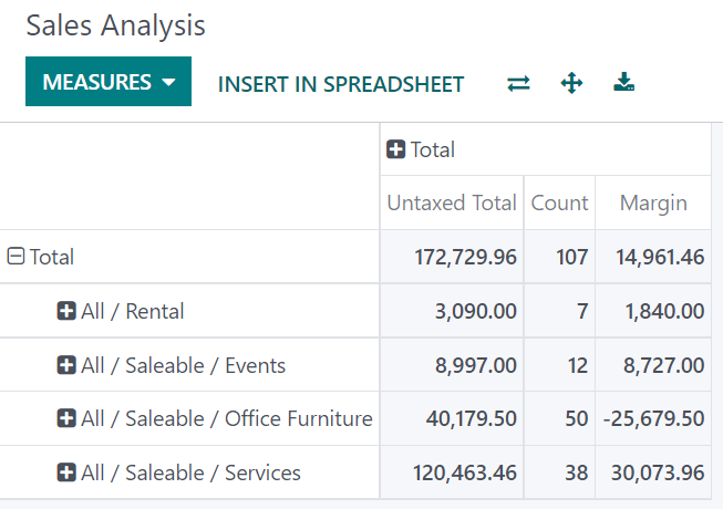
You could group the measures by Product Category at the level of rows on the previous Sales Analysis report example.
Using the pivot view
Grouping data is quintessential to the pivot view. It enables drilling down the data to gain deeper insights. While you can use the Group By option to quickly add a group at the level of rows, as shown in the example above, you can also click the plus button (➕) next to the Total header at the level of rows and columns, and then select one of the preconfigured groups. To remove one, click the minus button (➖).
Once you have added a group, you can add new ones on the opposite axis or the newly created subgroups.
Example
You could further divide the measures on the previous Sales Analysis report example by the Salesperson group at the level of columns and by the Order Date > Month group on the All / Saleable / Office Furniture product category.
Tip
- Switch the rows and columns' groups by clicking the flip axis button (⇄).
- Click on a measure's label to sort the values by ascending (⏶) or descending (⏷) order.
- Download a
.xlsxversion of the pivot by clicking the download button (⭳).
Using the graph view
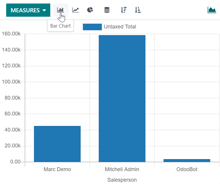
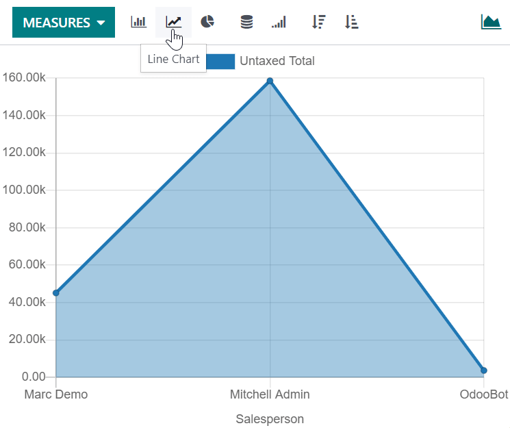
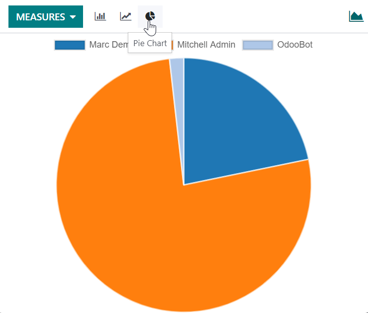
Three graphs are available: the bar, line, and pie charts.
Bar charts are used to show the distribution or a comparison of several categories. They are especially useful as they can deal with larger data sets.
Line charts are useful to show changing time series and trends over time.
Pie charts are used to show the distribution or a comparison of a small number of categories when they form a meaningful whole.
Tip
For bar and line charts, you can use the stacked option when you have at least two groups, which then appear on top of each other instead of next to each other.
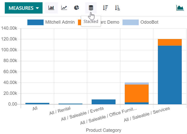
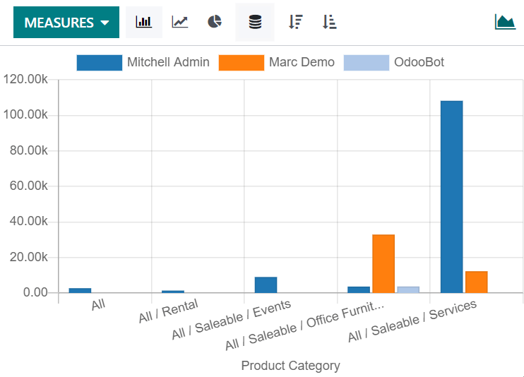
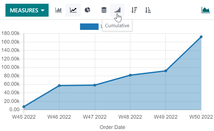
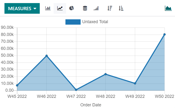
For line charts, you can use the cumulative option to sum values, which is especially useful to show the change in growth over a time period.
Common mistakes
- Reading a chart without checking the filters — the default period is rarely the one you meant.
- Measuring a field that is not what it sounds like: untaxed amount, total, and margin answer different questions.
- A pie chart with twenty slices. Use a bar chart.
- Exporting a pivot and then editing the numbers — the file is a snapshot, not a report that refreshes.
Was this article helpful?
Thanks — your feedback helps.
Running a window or door factory?
Ask for a demo